NYC DCWP - Financial Empowerment Center

Revamp FEC's online appointment-making portal for NYC residents, turned complexity into simplicity and clarity.

Client

The Financial Empowerment Center (FEC) at New York City’s Department of Consumer and Worker Protection (DCWP).

My Role

Design Lead

    My Works

    - Conducted research and user testings and facilitated design iterations
    - Led design meetings and decision-making processes.
    - Collaborated with 3 teammates to build prototypes and design solutions.

    Team

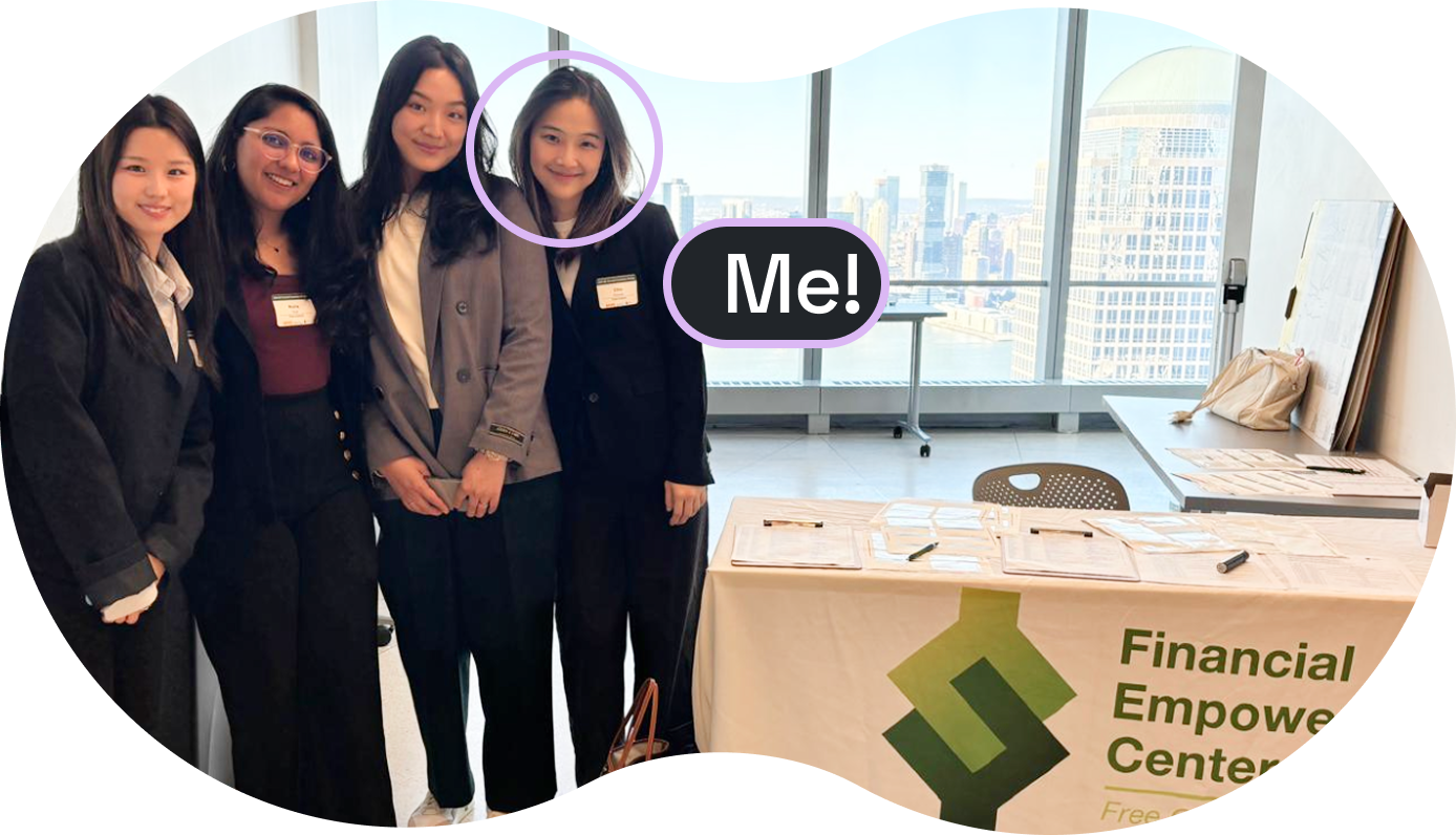
    4 UX consultants / designers

    Time

    12 weeks (2024)

    Impact

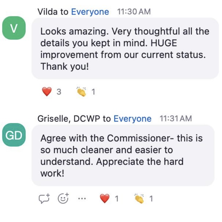
    We received positive feedback highlighting the new design’s intuitive navigation, simplicity, and effectiveness in addressing previously overlooked challenges. Clients' Rating:
    Our final design solutions were approved for implementation.
    "Looks amazing. Very thoughtful all the details you kept in mind. HUGE improvement from our current status."

    - Vilda, DCWP Commissioner
    View more about this project. ↓

    Background

    The Financial Empowerment Center (FEC) provides free financial counseling services to NYC residents, including topics such as budgeting assistance, credit improvement, student loans, and more.
    Any NYC resident over 18 years old, could make financial counseling appointments through the online portal.

    Problem

    low-completion rates
    Our client indicated that they saw a 300% increase in traffic driven by the marketing efforts, but the appointment completion conversion rates remain low.
    “We would like to lower the drops-offs during appointment-making process by improving the ease of use and eliminate any barriers.”


    - Peggy, Director of digital communication marketing team
    Research

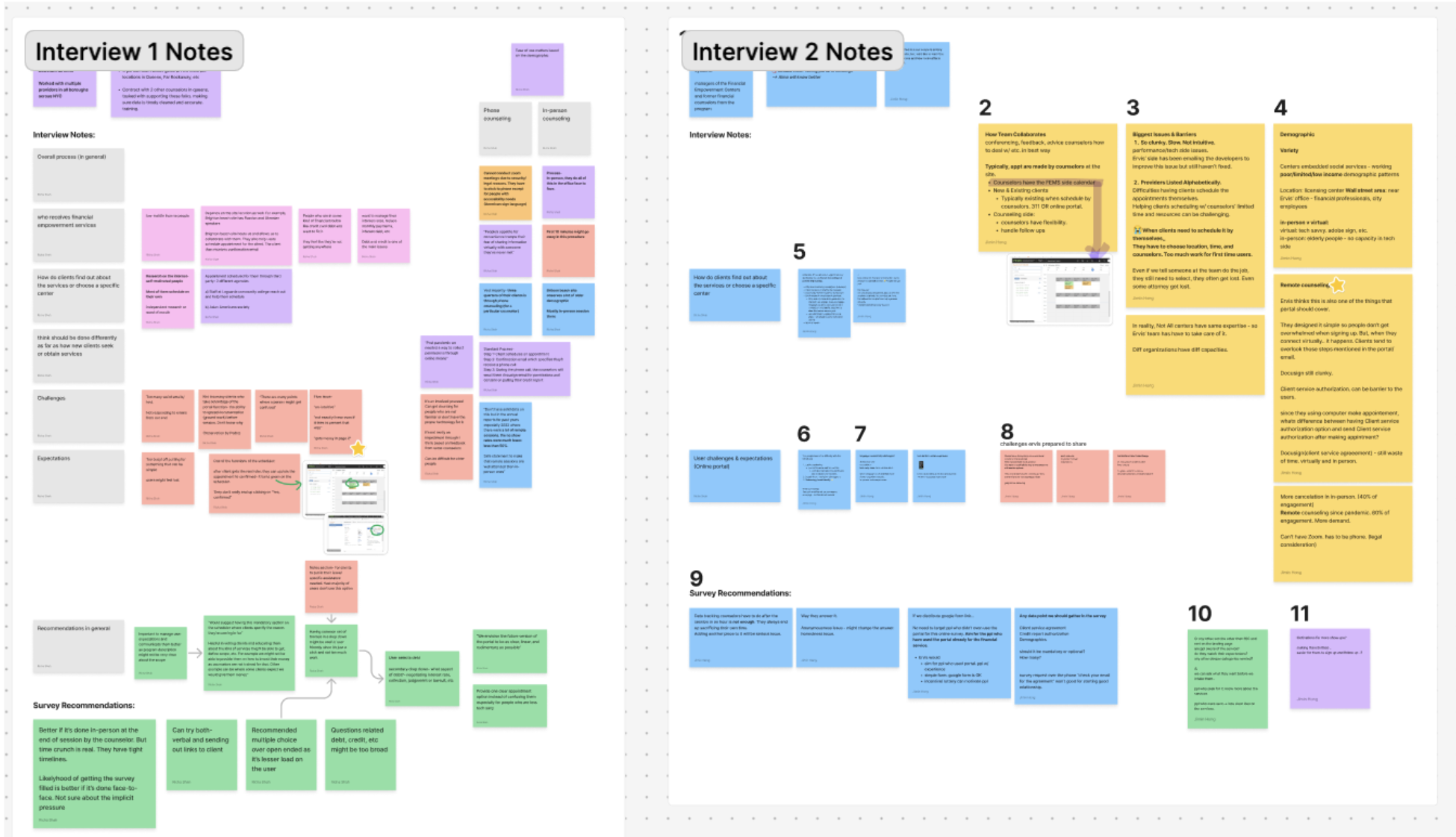
    Our team began with heuristic evaluation and planned further research to explore the appointment-booking journey.
    In total, we have conducted:

    7 in-depth stakeholder interviews

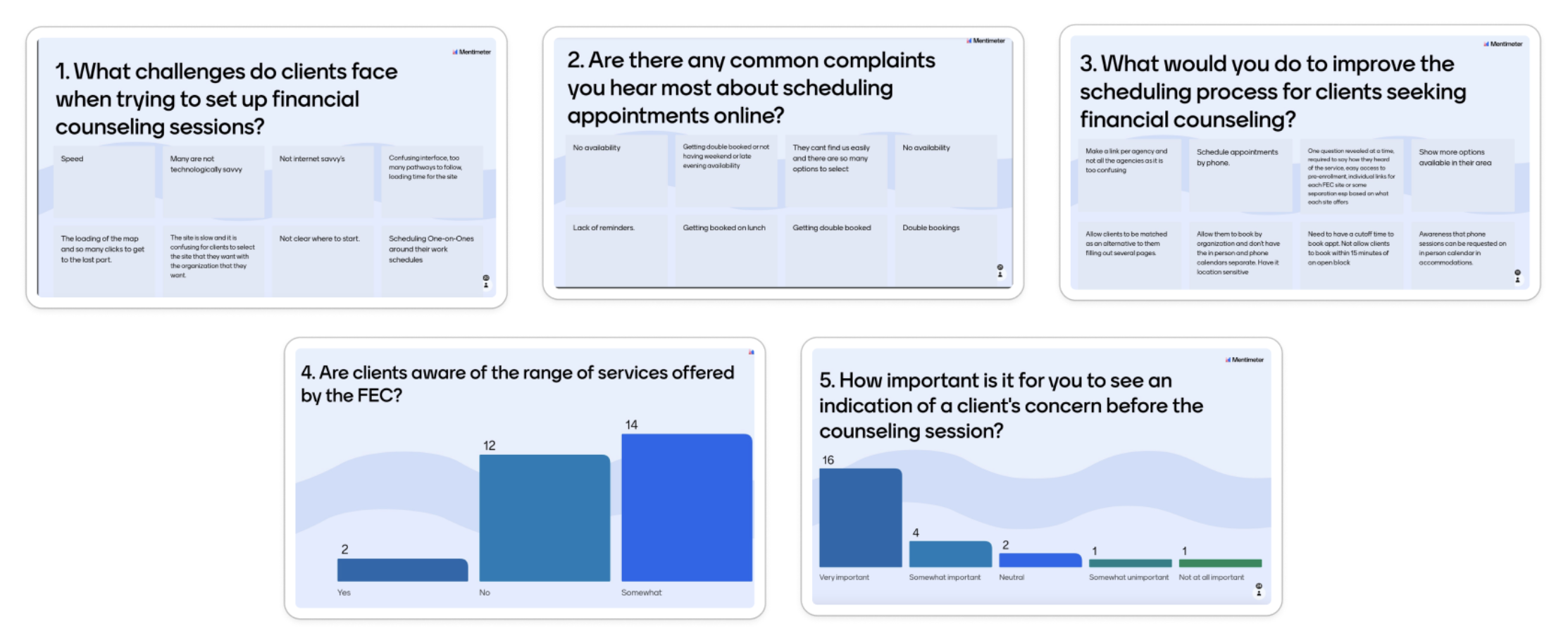
    Polls with 60+ counselors

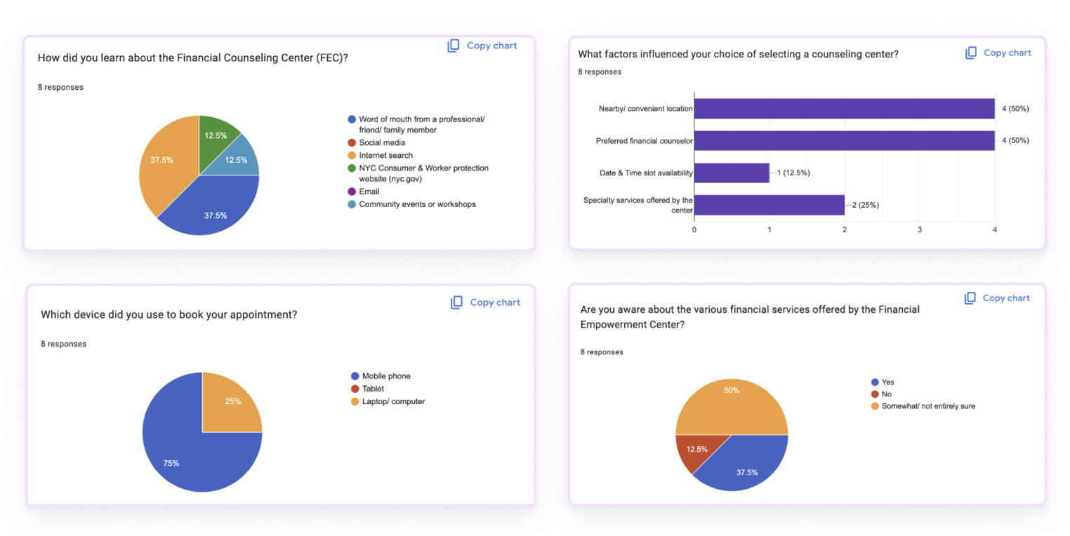
    Anonymous surveys with users

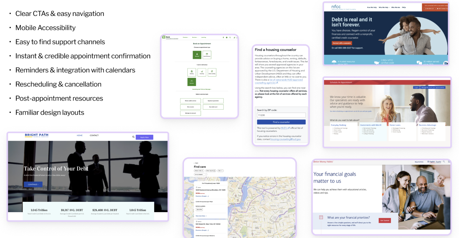
    Comparison with 12+ appointment making sites

    Challenge

    While research looks smooth, we encountered difficulties:
    Confidentiality constraints and intense timeline limited access to recruit and directly interact with end-users.

    We overcame it by...

    Working closely with the FEC team and counselor manager and successfully aligning on a feasible approach:
    A short lightweight survey that counselors could conduct at the start of their sessions with end-users. This approach received approval and let us learn users' thought about their booking experience.

    Key Research Insights

    1
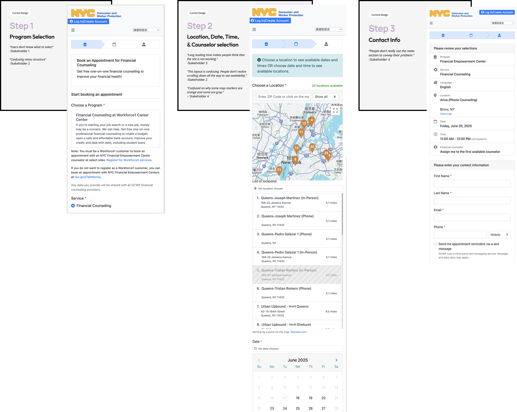
    Slow loading times caused confusion and frustration

    Each selection triggered long wait times throughout the portal. Many users assumed the system had crashed or that no appointments were available.

    (From step 1 to step 2 — It’s not a freeze frame.😅)
    2
    Overloaded content and unintuitive interactions discouraged users

    Among 3 steps, step 2 required users to select location, date, time, and counselor within a single screen.

    Based on research, we learned users abandon the booking during step 2 the most due to the complex information and confusing interaction, which led to high drop-off rates.

    (Step 2 — Overwhelming information on a page.)
    3
    Low-tech users have most difficulties completing by themselves

    Diverse user base, including older adults with limited digital literacy, struggled to complete the booking process independently.

    Design Strategy

    Streamline the current appointment-booking portal to rebuild trust, guidance and usability.

    Solutions

    1
    Apply progressive disclosure to restructure workflow

    To reduce loading times, we redesigned the booking process into smaller, sequential steps. By asking filtering questions upfront, we narrowed down data earlier.

    Meanwhile, we worked closely with FEC’s IT team to ensure the feasibility.

    2
    Simplify content-display, interaction, improve usability and build confidence

    To address content overload, we applied progressive disclosure and redesigned each step to focus on 1-2 tasks only. Clean visuals, clearer CTAs, and a visible progress bar gave users clarity and confidence throughout the journey.

    3
    Apply accessibility to design for wide user age range and many low-tech users

    To support older and low-tech users, We revamped the UI by referencing WCAG guidelines to improve digital accessibility and usability. For instance, we chose buttons featuring wider touch targets instead of checkbox selections.
    usability tests

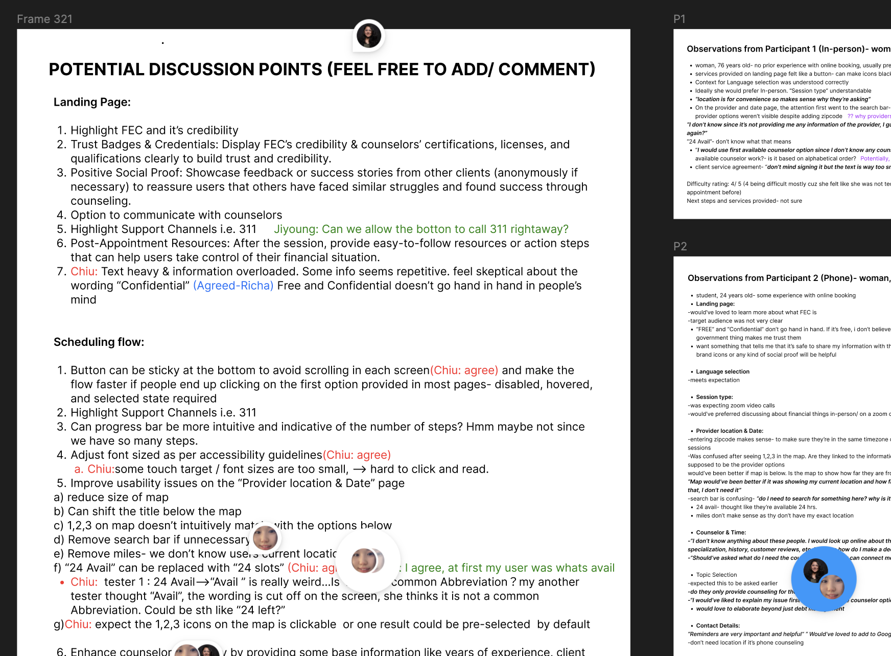
    With proposed design and prototypes, we conducted moderated usability tests with 8+ users, including 50% aged 55+ and organized our results.
    1
    Overall ease of use rating: 4/5

    (1 being very difficult, 5 being very easy.)

    2
    Complete time reduced by 20+ seconds in average

    “Overall this was easy to follow and the next steps were clear. “ - tester A
    “It was pretty straightforward and the questions were very simple to understand.” - tester B

    3
    12+ design iterations were made after usability testings

    We received suggestions regarding text-heavy, wording choices and visuals.

    Final Deliverables

    An easier Appointment-making experience with clarity and accessibility.

    Split into Steps, Not Stress
    Breaking down complexity so users don't get overwhelmed.
    Thoughtful Workflow Revamp
    Front-loaded filters reduce load times.
    Simple Task, Clear Guidance
    Simple interaction and task each step, guiding users with simple headlines and CTAs.
    Inclusive by Design
    Clear contrast, wider touch target, etc to ensure digital accessibility.
    Thank you for reading!

    If you are interested to learn more, feel free to reach out. I am happy to be the story-teller!

    Next

    Amazon Music Design Challenge